Stern Grove Festival
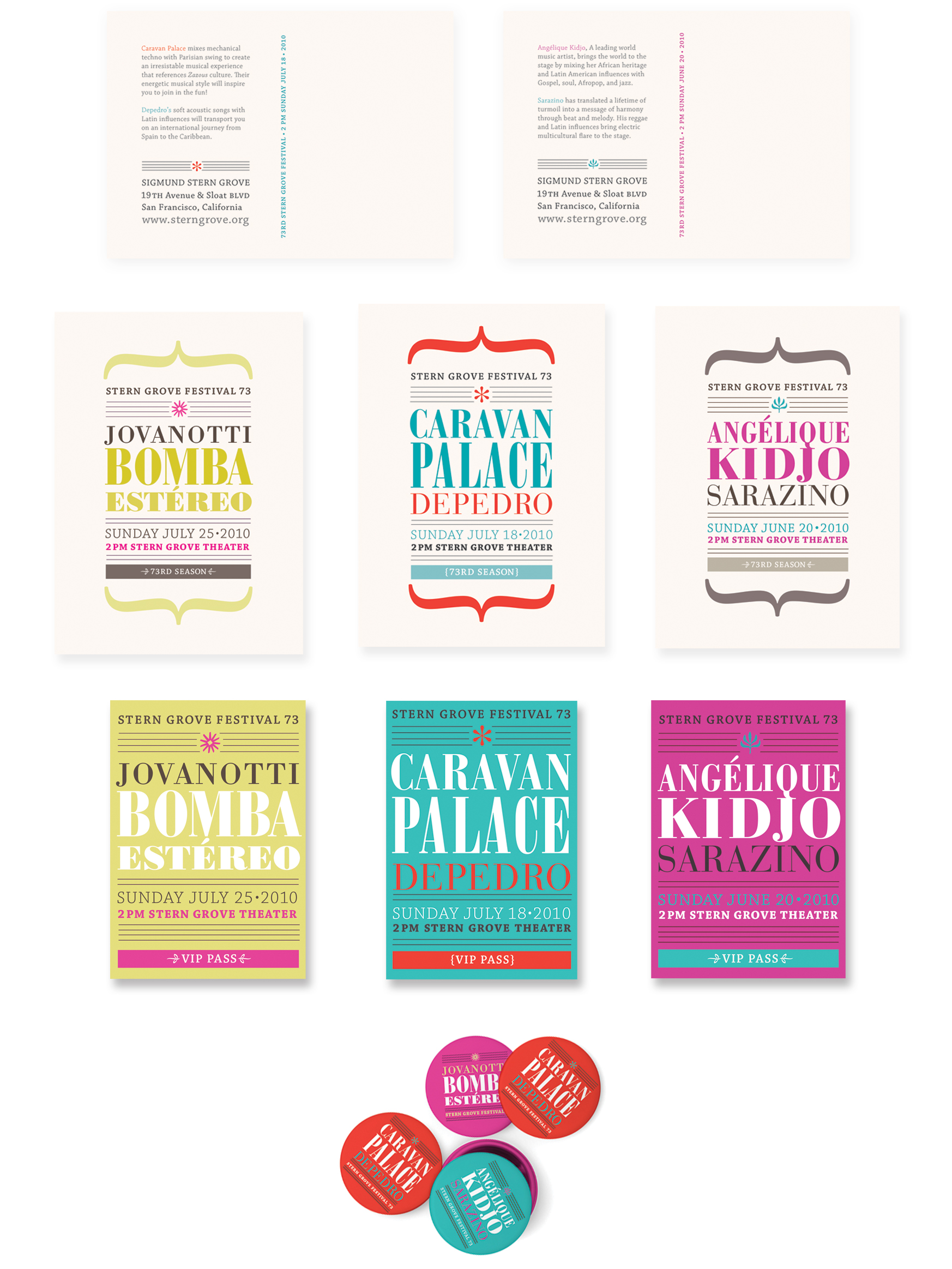
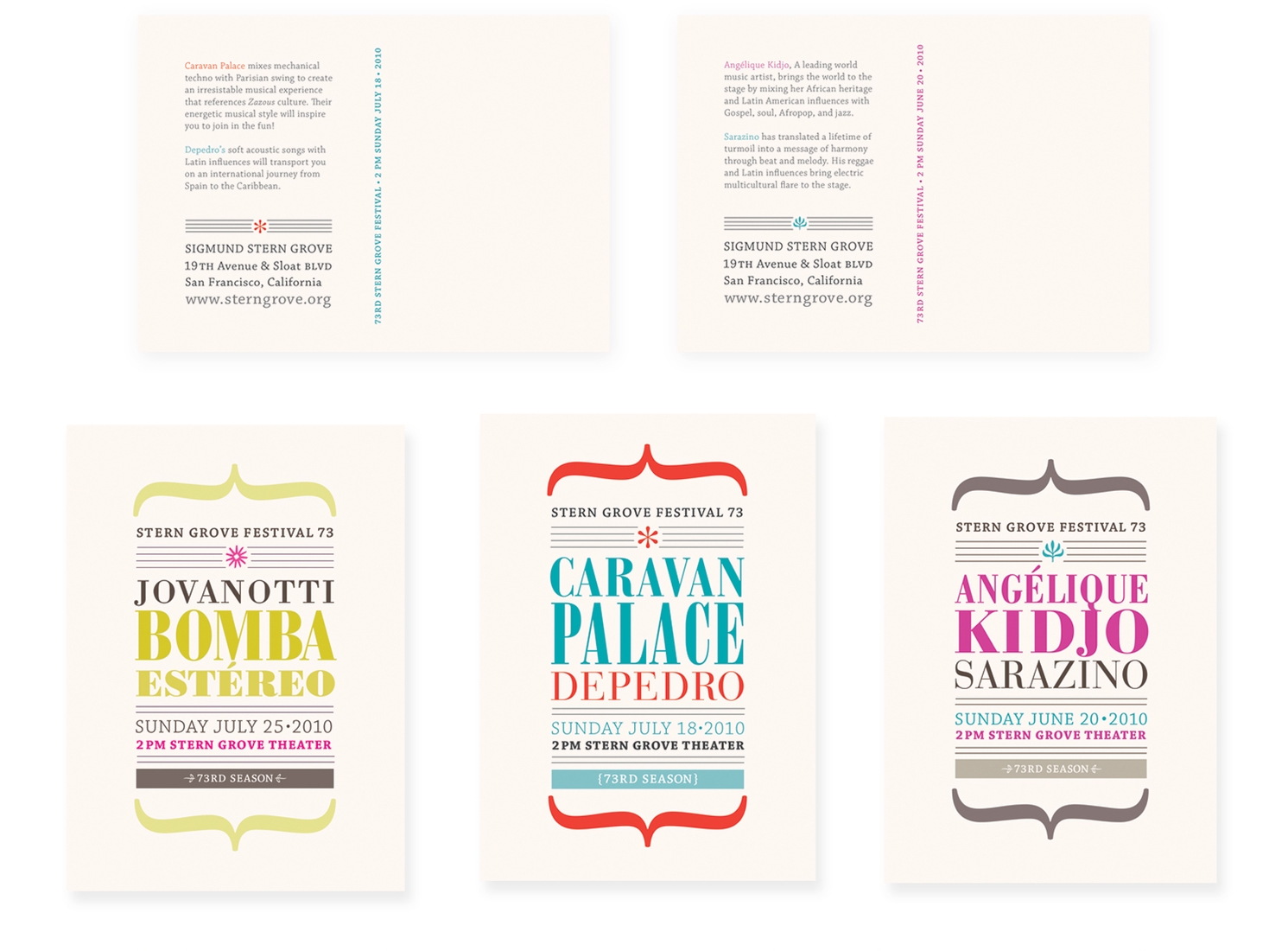
DIRECTIVES: Create a series of three postcards that use typography dynamically to convey a mood and spirit of the Stern Grove concert series and music. The target audience consists of young-spirited, music enthusiasts ages 16-40, and local festival-goers.
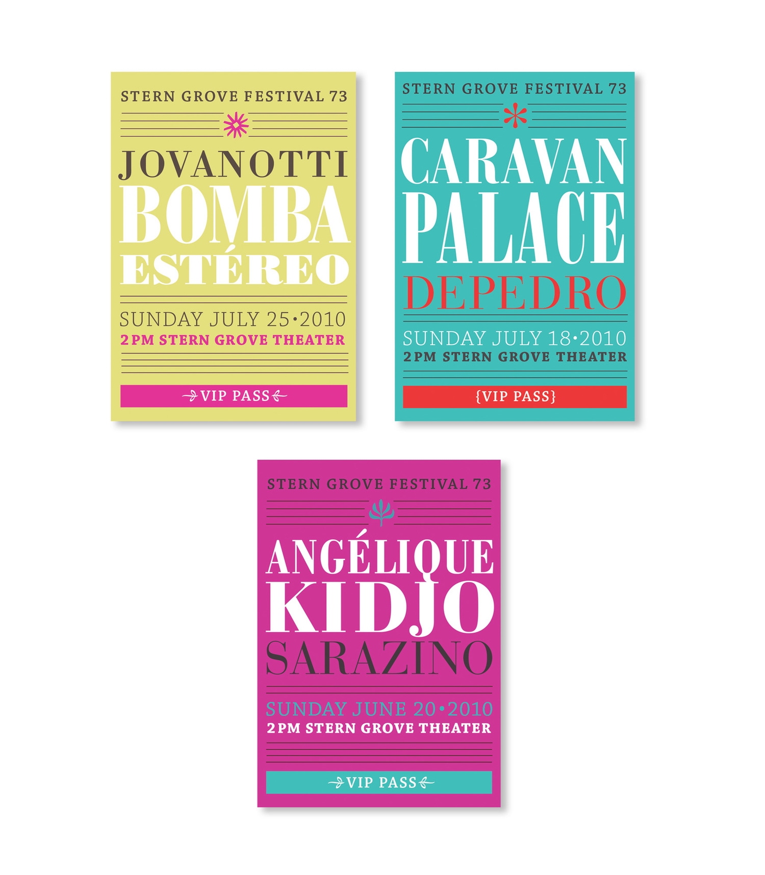
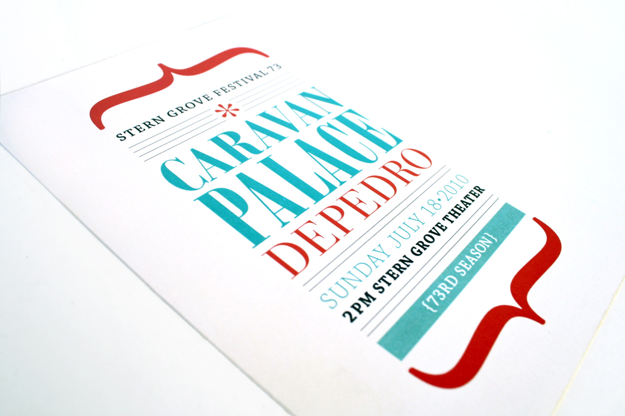
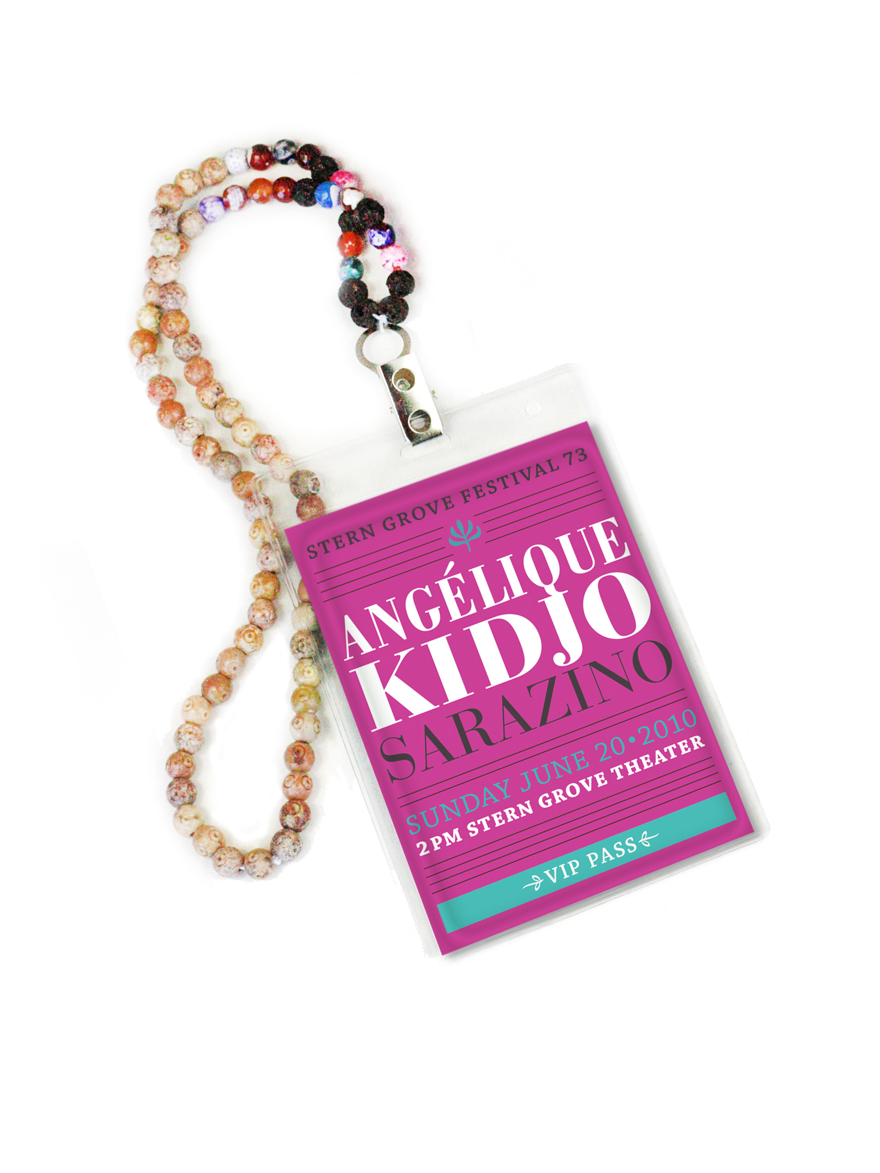
TACTICS: I researched all the musicians listed on the Stern Grove series schedule, selected three, read biography's, and listened to their music. I noted style, musical color, and cultural references. I created a type system with two contrasting faces that had colorful and visually striking form elements that I would use for all three designs. I differentiated the musicians by unique color coding and selected glyph elements from the Chaparral typeface family that highlighted the mood of each of their styles.
INSIGHTS: While the concert series is free, that is not its main draw. Potential concert-goers want more than a free concert they want to know they're going to see great musicians, and that they'll be part of a shared experience. Stern Grove is unique in that its situated in a beautiful redwood grove, that's both expansive while feeling very personal. You're likely to get a closer, better view of the featured artist than in most open seating concert venues. Space was definitely a design aspect I wanted to play with in the postcard series.
ASSUMED PERSONA: I put my self into the shoes and thinking of a young alternative music enthusiast and casual festival-goer to consider what design aesthetic would be expressive and appealing.
