
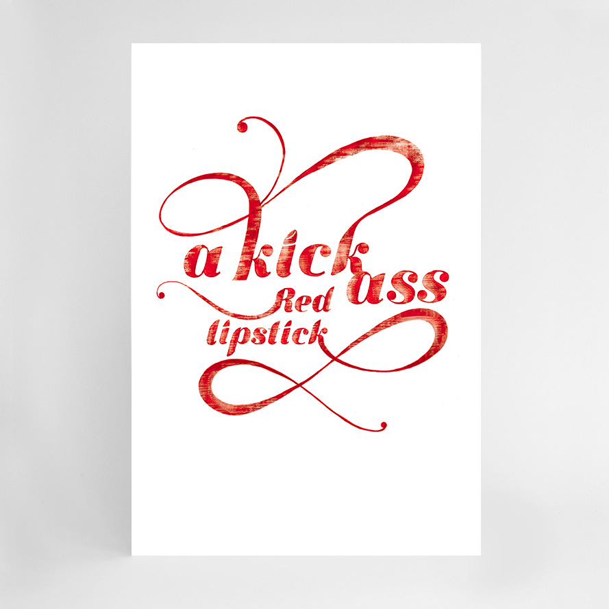
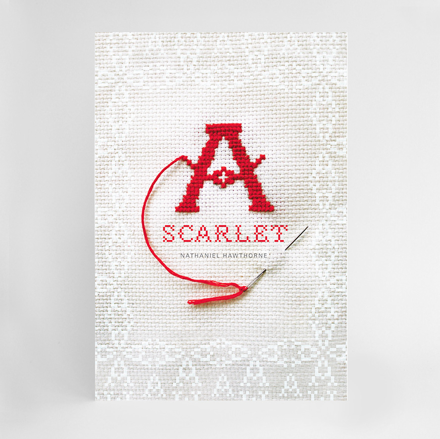
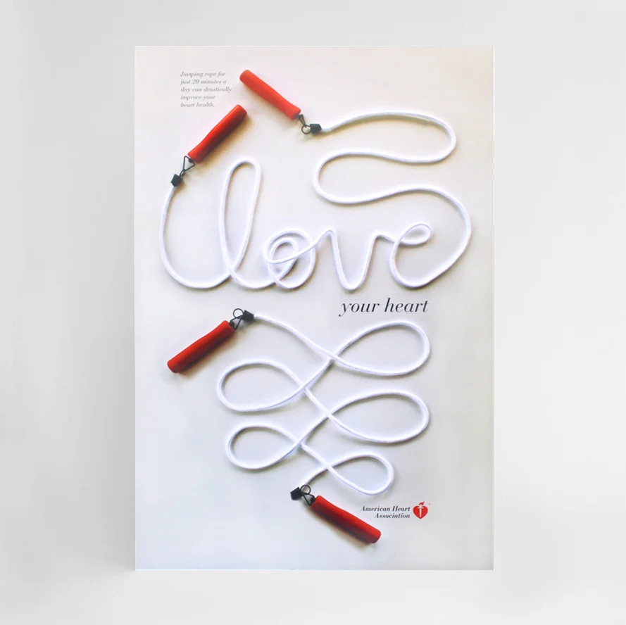
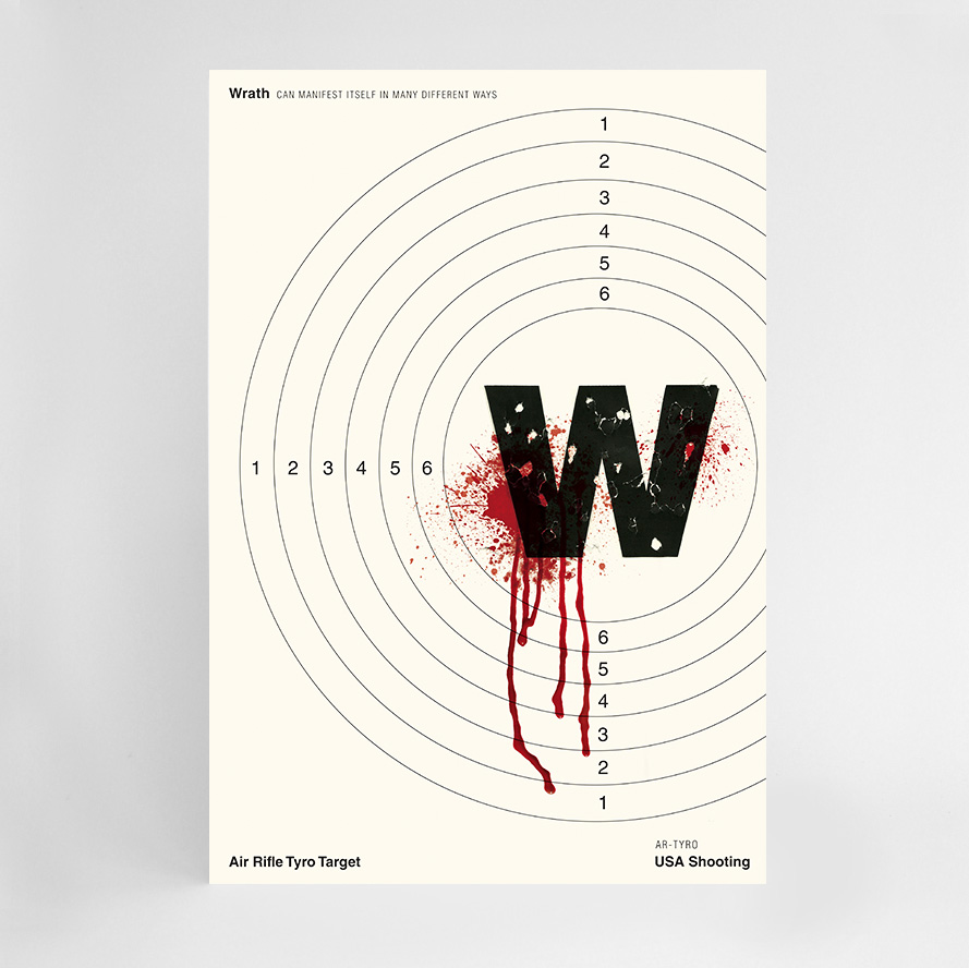
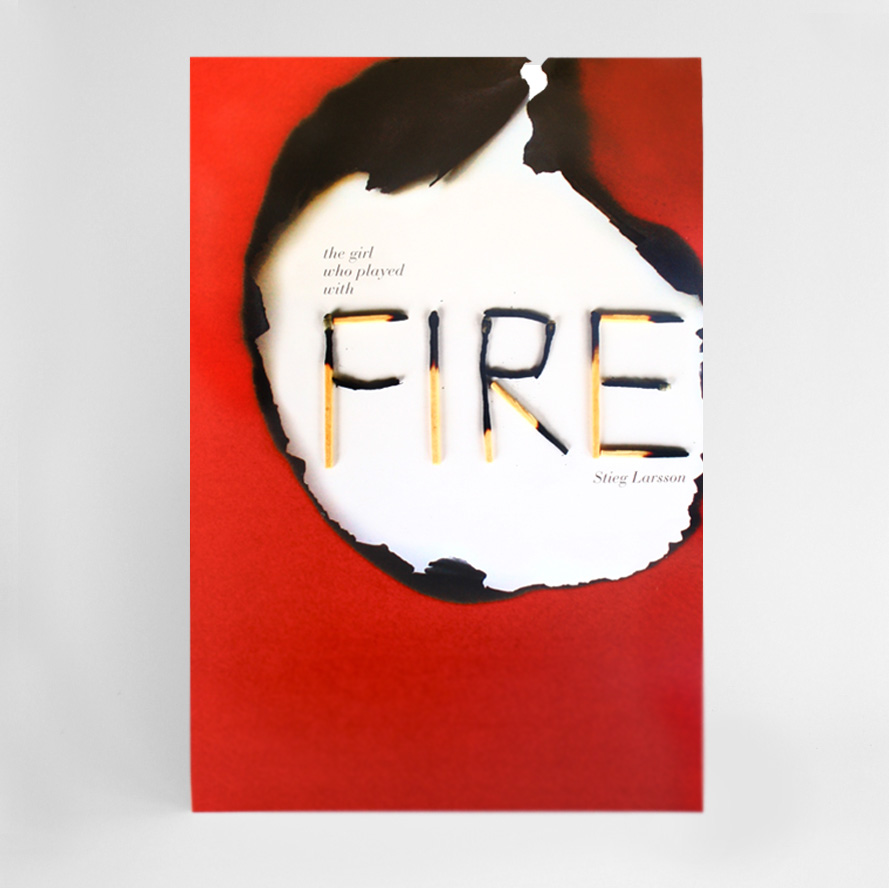
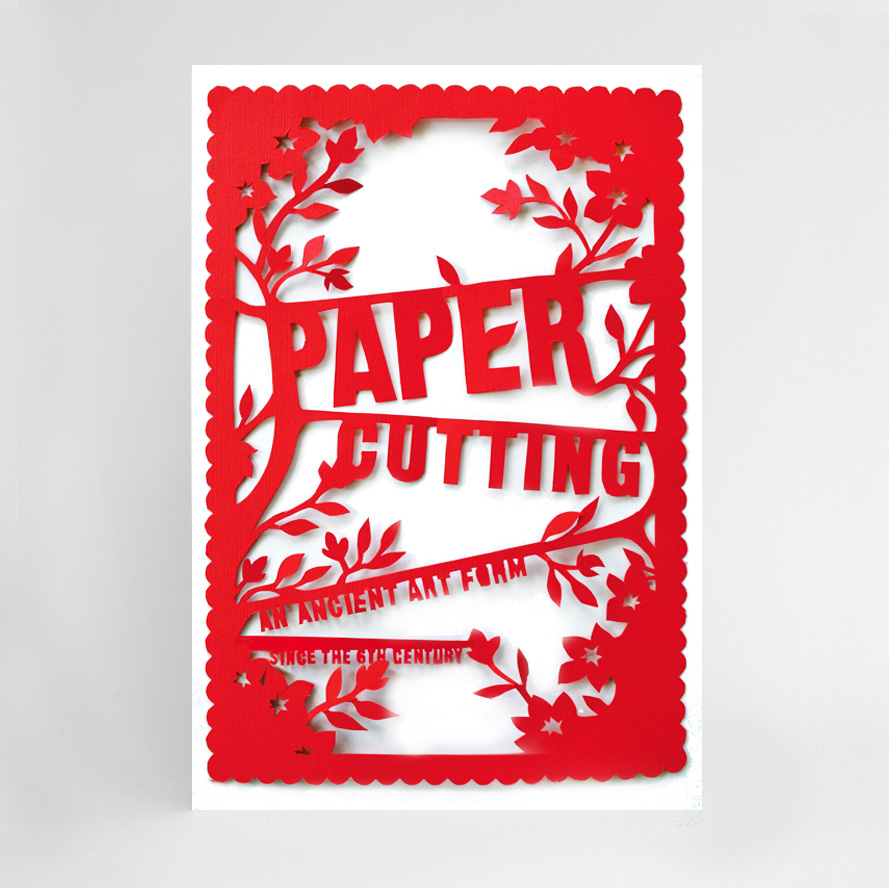
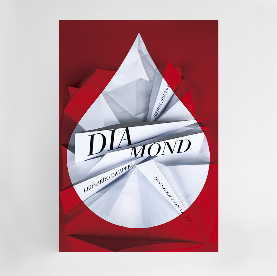
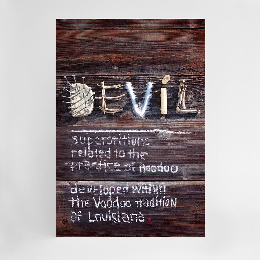
Red Poster Series
MISSION: I wanted to create a series of 12 experimental typographic posters that would utilize mostly hand-crafted techniques and elements following a concepts that revolve around the different cultural meanings and associations of the color red.
TACTICS: To develop 12 different design directions for the poster series, I first researched all the associations to the color red I could think of. I chose the color red because I knew there were numerous ways to express aspects of the color, from anger, rage, passion, to blood. It
was then a matter of narrowing down potential concepts to the most visually and conceptually compelling. I created several rounds of sketches followed by numerous tests beginning with hand-made processes, including rounds with paper, an exacto-knife, glue, and a copy machine.
INSIGHTS: Through the process of experimentation with different materials and tactics, many of the ideas I expected to work didn't and I discovered unexpected solutions that I wouldn't have otherwise thought of. The process of creative play this project provided the space for, resulted in more compelling poster designs.
ASSUMED PERSONAS: I had to become a researcher, thoroughly investigating the cultural associations, moods, and more casual meanings of the color red. I also had to become a craftsman of many different materials, techniques and hand-created solutions. I also became a photographer, editor, art director and creative director as I selected the design solutions to move through numerous rounds of refinement, ultimately to the final set.